


Nutrition labelling is a useful tool for making healthier food choices( Reference Baltas 1 ) and there is much academic research that identifies best practice on food packaging (see systematic reviews by Cowburn and Stockley( Reference Cowburn and Stockley 2 ) and Drichoutis et al.( Reference Drichoutis, Nayga and Lazaridis 3 )). There is, however, a lack of research that focuses on the design and position of online nutrition labels. According to the Institute of Grocery Distribution, a grocery research organisation, approximately one-fifth of UK households shop for food online at least once per month and the Institute predicts online sales equivalent to £11·1 billion in 2017( 4 ). Thus there is a strong rationale for the need to conduct this research and improve provision of online labelling.
The current paper presents a systematic study of the design of nutrition labels on the websites of five major supermarkets in the UK. The research aims to identify the degree of consistency of online nutrition label designs across both branded and own-brand product for each online retailer. It also aims to examine the relative position of the labels and the content consistency of a broad spectrum of product pages. It discusses the current state of online nutrition labelling in the UK, with particular reference to in-store equivalence, and suggests how improvements may be made through the use of dynamic displays including sorting and aggregation.
Nutrition labelling on packaging in the UK
In the UK there are currently two types of nutrition label in use on the physical packaging of food. A mandatory nutrition table appears on the back of the package and contains detailed technical information about nutrition values. The content of this table is regulated by the European Union (EU) and therefore has high consistency levels on physical packaging. This ruling also, according to the EU regulation (No. 1169/2011), applies to distance selling (online selling). It is therefore expected that, at the very least, a nutrition table would appear on every product webpage.
A voluntary ‘front-of-package’ labelling scheme also exists in the UK that provides a summary of nutrition values. The UK’s Food Standards Agency examined various methods for presenting nutrition information on food/drink packaging and found overwhelmingly that consumers preferred traffic light systems to other methods( 5 ). In 2013 it was reported that 60 % of foods found in supermarkets featured traffic light labels and five supermarkets had agreed to consistent labelling including Sainsbury’s, Tesco, Co-op, Waitrose and Morrisons( 6 ).
In 2013 the UK Government published a press release announcing new consistency guidelines( 6 ) based partly on findings by Draper et al.( Reference Draper, Adamson and Clegg 7 ) that concluded ‘multiple front-of-pack label formats in the marketplace may impede consumer comprehension and discourage use’. This finding supported previous research reports that found different presentation of nutrition information confusing( Reference Grunert and Wills 8 , 9 ). It is important therefore in a review of online labelling that both mandatory nutrition tables and optional ‘front-of-pack’ equivalents are examined together with their consistency of position, content and design.
Position of the nutrition label
Bialkova and Trijp’s( Reference Bialkova and van Trijp 10 ) results suggest that nutrition labels should always be printed in a consistent location on the package. Graham and Jeffrey( Reference Graham and Jeffery 11 ) reported that when viewing a mock shopping webpage screen, participants viewed 61 % of nutrition labels located in the centre of the screen but only 37 % or 34 % of labels positioned on the left- or right-hand position. In addition, nutrition labels had extended fixation times when placed in the central position. Neither set of authors examined the position of labels in actual online systems to ascertain how primary they are in the field of vision, in terms of scrolling requirements or opportunities to buy without labels present on the page.
Design of the ‘front-of-pack’ nutrition label
Previous research( Reference Van Herpen and Van Trijp 12 – Reference Feunekes, Gortemaker and Willems 14 ) demonstrates that logos and traffic light colours performed better than nutrition tables in terms of gaining attention and improving comprehension. Use of detailed tables alone is problematic for a number of reasons. Items listed further down on the nutrition table are likely to be looked at less than those at the top( Reference Graham and Jeffery 11 ). According to Higginson et al.( Reference Higginson, Kirk and Rayner 15 ), fat and energy are the most looked-at nutrients on the nutrition label. This may lead to difficulties such as a choice of a product that has, say, low fat content but very high sugar levels. In addition, too much detailed information might be problematic for users with lower education levels( Reference Feunekes, Gortemaker and Willems 14 ). Any examination of website nutrition labelling therefore has to take into consideration the use of summary ‘front-of-pack’ graphics as good practice generally (although there are doubts in some studies about the overall impact recommended summary graphics have on sales( Reference Sacks, Rayner and Swinburn 16 )). Colour has also been found to be a useful visual cue in highlighting the health quality of food. While monochromatic displays have been found to be more effective for capturing attention( Reference Bialkova and van Trijp 10 ), other studies reported that consumers prefer and can better understand colour-coded designs (in particular, the multiple traffic light system) than monochromatic labels( Reference Grunert and Wills 8 , Reference Jones and Richardson 17 , Reference Kelly, Hughes and Chapman 18 ).
Content of the label
There remains contention about how best to quantify the health value of a food/drink product. Generally nutrition tables contain ‘Amount per 100 g’ and ‘Amount per serving’ of, at the very minimum, energy (calories, kcal), fat, saturated fat, sugar and salt. Traffic light systems are based upon the amount of these values found in 100 g of the product.
The Guideline Daily Allowance (GDA) figure, or Reference Index (RI%) as it is now known in the UK, is a different system that presents the approximate daily amount of nutrients and energy (as a percentage) recommended for a healthy, balanced diet. The Which? report Healthy Signs?, authored by the UK’s largest consumer body, found that two-thirds of the participants had heard of GDA, but only one in five actively used them( 9 ). This contrasts somewhat with the findings of some published research that RI% values can help in comprehending nutrition information( Reference Grunert and Wills 8 , Reference Borgmeier and Westenhoefer 13 ). Given these conflicts, RI% values are often featured alongside values ‘per 100 g’ and it is important to understand their frequency of use online.
Recommendations from the literature review above highlight several key criteria to assess in the consistency of nutrition labels: a consistent and salient position, inclusion of a summary display and use of colour to aid comprehension. More contentious issues including inclusion of a RI% will also be examined to measure consistency of design content as well as presentation.
Methodology
In order to identify consistency among supermarket websites a systematic study of product webpages and search results pages was undertaken. In addition, physical packages were inspected to ascertain consistency level between online and in store.
The two main hypotheses underpinning the research were:
-
1. Own-brand products across each supermarket site would have high consistency levels for content and visual design of nutrition information given each supermarket’s responsibility for product information and brand values within the site.
-
2. The online presentation of nutrition information would, at the very least, improve on in-store physical labelling given retailers’ ability to present a product within a supermarket-branded interface.
Major supermarket websites in the UK that offer online shopping were selected for examination. These were Asda, Tesco, Waitrose, Morrisons and Sainsbury’s. Ten common grocery items were chosen that represented a range of foods and drinks. These featured diary, meat, vegetables, meal components and snacks comprising orange juice, coca cola, baked beans, mayonnaise, sausages, cornflakes, digestive biscuits, frozen peas, Bolognese sauce and yoghurt. These reflect the major food groups bought by UK consumers( 19 ).
These products were also aligned with well-known, brand leader manufacturers. This made branded versions likely to be stocked across all five supermarkets, allowing for direct comparison of identical products in all but one case (where a different brand of sausages was considered for Waitrose). Brands chosen were Tropicana, Coca-Cola, Heinz, Hellmans, Wall’s, Kellogg’s, McVities, Bird’s Eye, Dolmio and Onken, respectively. Webpages of ‘own-brand’ equivalent products (equal or similar in weight/format) were also examined, resulting in twenty webpages examined on each supermarket’s website.
In total, 100 webpages were examined to categorise how the nutrition information was presented. Categorisation used evaluation criteria developed specifically to account for the variability of nutrition labels, named here as the PCD (referring to position, content and design) criteria. They take into account:
-
1. Position: page types (‘search results’ or ‘product description’) featuring nutrition labelling and scrolling required.
-
2. Content: inclusion of RI% information.
-
3. Design: graphical format (graphic summary or table) and colour usage.
The PCD data were then analysed in terms of consistency within each supermarket to reflect the browsing experience of a user. Comparisons were made between supermarkets to identify if any supermarket achieved higher degrees of consistency. Comparisons were also made between online labels and in-store physical labels.
Webpages were examined on both a Mac and PC laptop (13-inch and 15-inch screen, respectively). Scrolling (‘below the fold’) judgements were based on an average screen resolution of 768 pixels in height. Data were gathered by one researcher following the exact same procedure twice to double check that data were accurate. Data were gathered in July 2015. Tablets or mobiles were not used in this particular study although these will also require examination in the future as more users switch to tablet shopping.
Results and discussion
Position of nutrition labels
None of the supermarkets displayed any nutritional labels on the search result page. The only graphical interventions related to price, such as use of a red highlighted corner graphics displaying ‘offers’. Items could all be purchased directly from this search result list view with no nutrition information shown on the page. This is a different experience from handling a product in reality, given viewing opportunities afforded by back-of-pack and front-of-pack labels. The new EU regulation No. 1169/2011 outlines the need for information to be in the ‘principal field of vision’ where possible. The application of this regulation to online information therefore requires further review.
The lack of nutrition summary labels on the search pages showing multiple products makes it difficult to compare two products together because, unlike in a real supermarket setting, the customer is unable to pick up both products simultaneously. According to Higginson et al.( Reference Higginson, Kirk and Rayner 15 ) comparison is the most common task performed with nutrition labels and this, it appears, needs to be supported more readily online.
A nutrition label was present on the product description page once the product had been clicked from the results page in all cases. Morrisons also featured an intermediate ‘quick view’ stage that featured less information and no nutrition labelling. This was accessed by clicking the picture of the product, arguably a larger hotspot than the small name beneath it. On the Morrisons site therefore there were two opportunities to purchase the product without the presence of nutrition labels on the webpage.
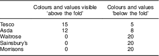
Designs featuring summary formats (e.g. multiple traffic light systems showing five values rather than detailed nutrition tables) were much more likely to appear ‘above the fold’ (e.g. without the need to scroll) when viewed using a typical 768-pixel height monitor. Table 1 shows the frequencies where nutrition information or colours were readable above the ‘fold line’ without the need to scroll. It highlights a general problem with many product page designs (e.g. the prioritisation of general product information above nutrition information) and should provoke more consideration among the designer community. Figure 1 shows an example of one of the examined pages, turned into a schematic page made to scale, where both the summary format and table were well below the fold line. The schematic approach should help designers judge relative positioning and encourage the review of the size of the product picture (which can push down the labels) as well as the use of side columns that may more easily sit adjacent to products displayed in the centre.
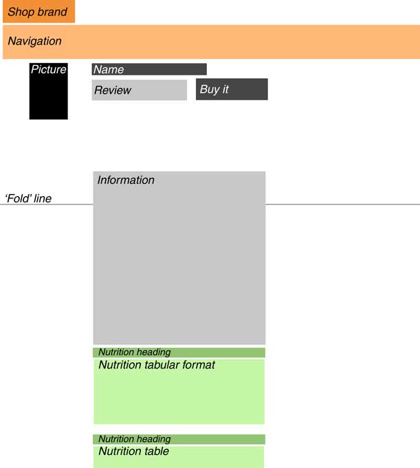
Fig. 1 A schematic of one page where nutritional information was well below the ‘fold line’ and thus required scrolling to reach
Table 1 Frequency of nutrition labels that appeared online in their entirety ‘above the fold’ (without scrolling) and ‘below the fold’ in a study of nutrition labels on own-brand (n 10) and branded products (n 10) on the websites of five large online food retailers in the UK, July 2015
In seven cases, nutrition information was found in two locations on the same page. In the case of Morrisons there were three instances of RI% found in a small paragraph of text on the right-hand location whereas the nutrition information heading and table (without RI%) were lower down on the left. This could make the scanning of nutritional information particularly difficult.
Inclusion of Reference Index values
As shown in Fig. 2, in total across all supermarkets, 22 % of pages did not feature the RI%. Waitrose failed to show the RI% for almost half the sample overall. In terms of actual physical packaging only 4 % of products failed to feature RI% and thus the quality of information on the online sample as a whole is weaker than on physical products.
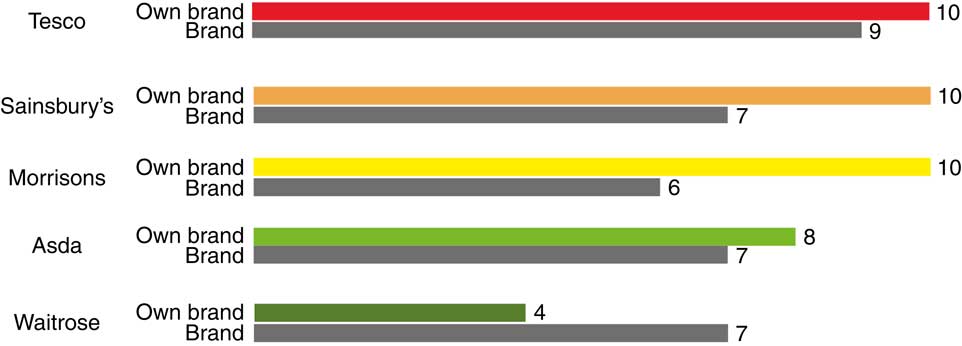
Fig. 2 Frequency of product pages showing the Reference Index (RI%) value in a study of nutrition labels on own-brand (n 10) and branded (n 10) products on the websites of five large online food retailers in the UK, July 2015
The RI% appeared more frequently on own brands than branded products online and there was a strong level of consistency for three supermarkets in this respect. These three supermarkets also had 100 % consistency on their physical packaging for RI% inclusion, thus these results are somewhat expected. Waitrose was less consistent on its physical packaging: 7/10 of its own-brand products showed RI% in the supermarket whereas only 4/10 of its own-brand products showed RI% online.
Further inconsistencies between in store and online are apparent. All branded products showed RI% on their physical labels and thus there appears to be a lack of accurate replication when moving from the physical pack to online.
Label design variation
In the pages examined there were a total of eight designs of nutrition label found. A ‘design’ could include the following variations: inclusion of a summary (in colour or black and white), inclusion of a standard nutrition table (with table cells in colour or black and white) and inclusion of the RI%. These designs are presented in Fig. 3 together with a visual key.
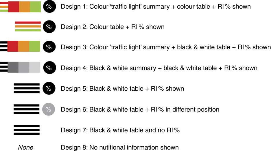
Fig. 3 The eight designs of nutrition label
The frequencies of the labels found in the sample of 100 webpages are shown in Fig. 4.

Fig. 4 Percentage of nutrition labels found online in a study of nutrition labels on own-brand (n 10) and branded products (n 10) on the websites of five large online food retailers in the UK, July 2015 (see Fig. 3 for design categories)
In all but one instance, all websites met the mandatory requirement to show nutrition information, albeit in the format less favoured by consumers( Reference Van Herpen and Van Trijp 12 ): the nutrition table. In this respect the pages were generally consistent. Black and white nutrition tables without summaries were found in 43 % of the sample pages. Forty-one per cent of the sample employed ‘traffic light’ colours either in summary format or in the table. This suggests that front-of-pack equivalent summaries are not overly employed online despite the call for easier nutritional information and the Food Standards Agency’s recommendations from 2013( 6 ).
Figure 5 shows the frequency of label design types on in-store physical packaging across the sample of sixty products (fifty own-brand and ten branded products). As can be seen, generally physical labels were more consistent than online labels across the whole sample of supermarkets.
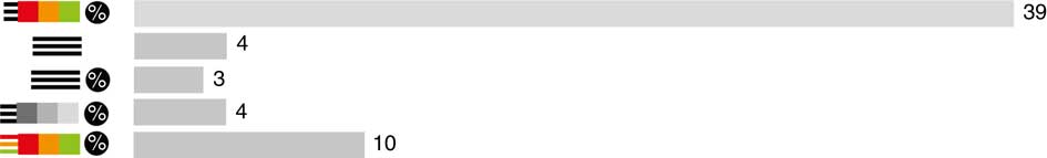
Fig. 5 Frequency of nutrition label designs found in store (out of a total of sixty products) in a study of nutrition labels on own-brand and branded products on the websites of five large online food retailers in the UK, July 2015 (see Fig. 3 for design categories)
Colour and format of presentation
Figure 6 shows that Sainsbury’s, Asda and Tesco were most likely to use traffic light colours in their online designs than the other supermarkets.
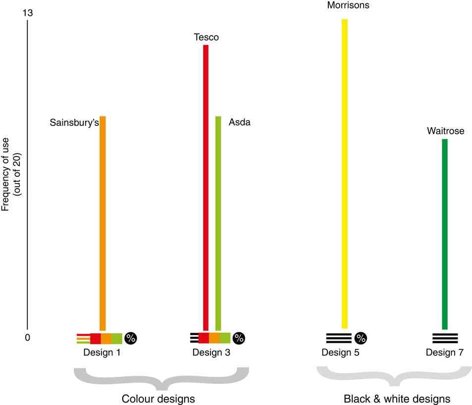
Fig. 6 Most popular designs featured by each supermarket in a study of nutrition labels on own-brand (n 10) and branded products (n 10) on the websites of five large online food retailers in the UK, July 2015 (see Fig. 3 for design categories)
Figure 6 also shows that the supermarkets appear to have chosen different dominant label designs from one another (except for Asda and Tesco using the same combination).
Morrisons made no use of colour, despite its extensive use of colour for own brands on physical in-store packaging. Strategically perhaps the use of colour for own-brand product descriptions is to promote sales, although this is often not consistently done. Since colour has been highlighted in other studies as a useful device the use of colour should be extended.
Use of a simplified summary, which should be easier to glance at than a nutrition table, featured in only 55/100 designs, see Fig. 7. There appeared to be no clear relationship between branded and own-brand goods and label designs used across the whole sample; however, Tesco was able to present its own-brand products with a high degree of consistency. Summary labels never replaced nutrition tables as both were present on the screen (although they were never grouped together in the same space). Generally, as has already been noted, while some summaries were ‘above the fold’, all full nutrition tables required scrolling to reach which, during time-constrained usage, lessens the likelihood of viewing.
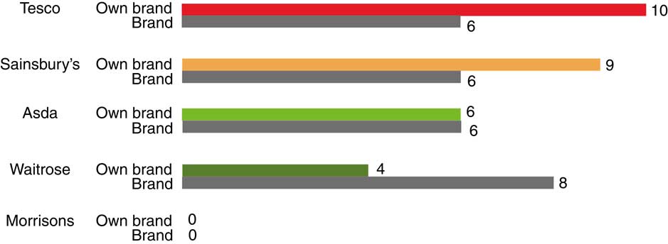
Fig. 7 Number of product pages featuring a summary format in a study of nutrition labels on own-brand (n 10) and branded (n 10) products on the websites of five large online food retailers in the UK, July 2015 (see Fig. 3 for design categories)
Overall consistency: how many labels do supermarkets use?
Supermarkets differed in the frequency with which they employed each design type. In terms of consistency within one site, Table 2 shows the number of designs used by each supermarket (indicated by the number of rows) and the frequency of those designs (the number in each row).
Table 2 Supermarkets’ use of different label designs ordered by variety of designs used in a study of nutrition labels on own-brand (n 10) and branded products (n 10) on the websites of five large online food retailers in the UK, July 2015 (see Fig. 3 for design categories)
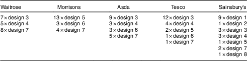
In terms of a consistent experience using one site (as is most likely to be the case when shopping), Morrisons and Waitrose provided perhaps the most consistent experiences using only three different label design combinations across twenty products. Sainsbury’s provided a fairly consistent experience for own-brand products (9/10 of its own-brand products were designed using design 1) although it is likely that the user would still view both brands and non-brands and thus the experience would still be relatively inconsistent.
Consistency between online and physical packaging
Given that the sample included the same ten branded products across all the supermarkets and that each sample page represented a product that has physical packaging, it was hypothesised that online labelling would, at the very least, mirror the physical package, if not improve on its accessibility. As previously stated, since ‘front-of-pack’ labels are not mandatory, there is still an inconsistent experience for the consumer in the supermarket itself and not all branded products feature ‘front-of-pack’ labels. However, given that nutrition information is stored within the database of the website, in theory it should be possible to generate ‘front-of-pack’ displays and actually improve on the current packaging provision.
Table 3 displays the degree to which the online product nutrition label was consistent with the physical label. Where the online label was the same in terms of format (e.g. colour, summary and/or table) and RI% inclusion, the two are classed as equal (and thus consistent with each other); ‘=’ indicates consistency within Table 3. However, where the online label featured less accessible information (such as the loss of the summary, colour or the RI%) or improvements (such as the addition of a summary, colour or the RI%), this has been categorised with either with an upward or a downward arrow, respectively.
Table 3 A graphical summary of comparisons between online and real packaging in a study of nutrition labels on own-brand (n 10) and branded (n 10) products on the websites of five large online food retailers in the UK, July 2015
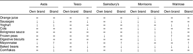
=, consistent information; ↑, additional information/summary/colour; ↓, removal of information/summary/colour.
As can be seen, supermarkets rated differently for consistency between online and in store. Morrisons was particularly weak in consistency (90 % of pages were inconsistent with in-store labelling) since product pages lacked both summaries and colour online. In-store, both colour and summaries existed on all own-brand products.
In most cases, except Morrisons, the presentation of nutrition information was found to be mostly consistent with actual packaging in terms of colour usage. The greatest factor of inconsistency was the loss of the RI% value that was almost always present on the physical package but not always included on the product webpage.
As hypothesised, most supermarkets (except Morrisons and Waitrose) achieved higher levels of consistency for their own-brand products than branded products. Despite identical information being provided to retailers from manufacturers, there appears to be an issue with replicating information online and certainly with improving information provision (such as generating summaries or generating colour displays). If the in-store experience lacks consistency there appears to be an even greater issue with online systems. In 99/100 pages, nutritional values were shown for each product. Thus technically it should be possible for supermarkets to present all products in a consistent manner for their users. This, however, appears not to be the case.
Future expansion
As the design of nutrition labels shifts, in an online environment away from manufacturers’ packaging towards retailers’ websites it is important to consider the potential functionality afforded by dynamic displays.
Despite 99/100 pages displaying nutritional information there was no attempt to integrate this information within the general system architecture of the websites. Functionality such as being able to sort product listings by energy or fat content was absent (see the proposal in Fig. 8). The system proposed in Fig. 8 would enable comparisons between products and enable the shopper to discern products with particularly low values. To counter misuse, such as the over-reliance on one value such as fat, sorting could also occur among several nutrition values simultaneously to produce ‘top ten’ product lists. Currently products are discriminated against via existing search systems by price and brand name. An additional sorting system based on nutritional values would provide the food industry with a clear incentive for improving nutritional benefits to challenge competitors. Such a proposal would require consultation with a range of stakeholders including supermarkets, the food industry and consumers, to ascertain the risks and benefits of the system.
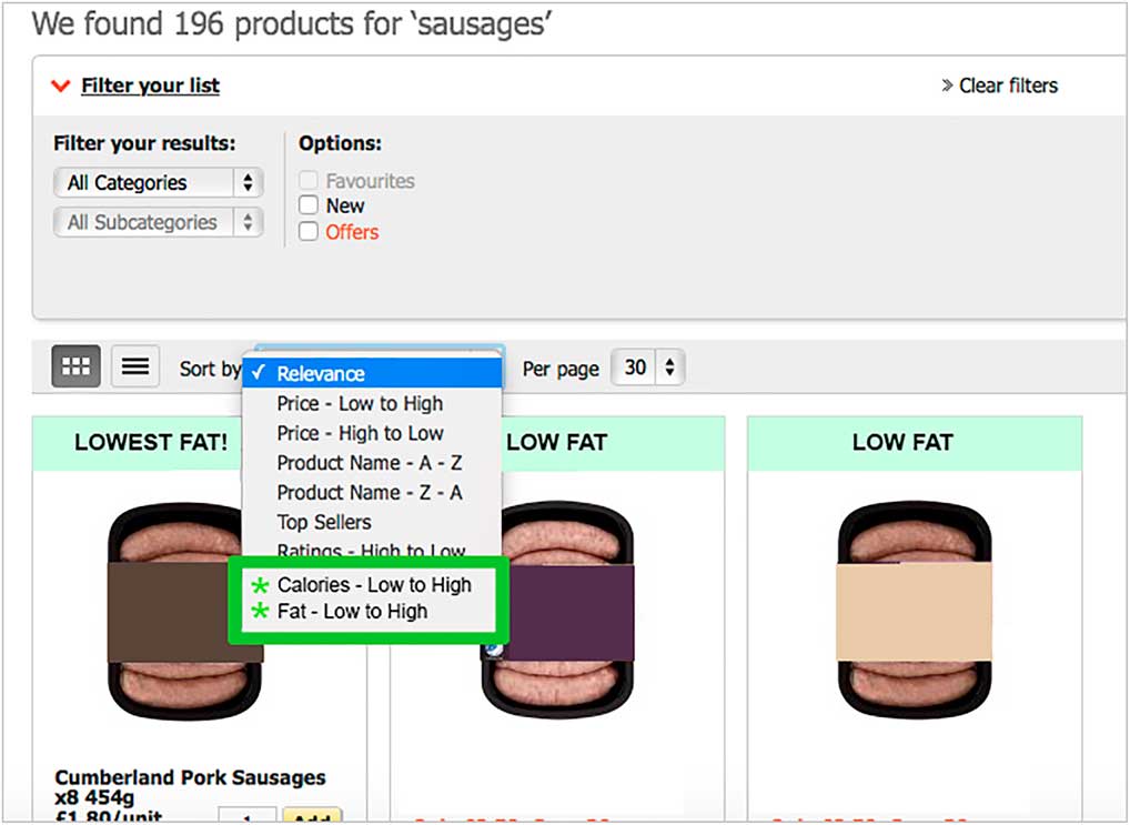
Fig. 8 A proposal design for the addition of sorting by nutrition values
On a more basic level, a very simple ‘tick’ or ‘healthy option’ could also be included on the search results page, dynamically generated and extracted from the database entries for that product. As traffic light systems become more common generally, a small version could be included on the search results page that displays colours only to enable rapid scanning of comparative nutrition information.
A further proposal here involves an experience at the ‘checkout’ where traffic light information is aggregated. The so-called ‘Checkout Health Check’ could provide an optional tally of an entire ‘basket’ for the five key nutrition indicators, see Fig. 9. A summary display could also calculate the average number of products with one to five red lights. With the inclusion of additional database fields this could even separate child-friendly foods and provide comparisons with transactions from previous weeks/months. It could also, vitally, suggest healthier options if the consumer wants to change a product.
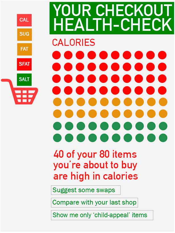
Fig. 9 A proposal for an optional pop-up ‘health-check’ at the checkout
Such an aggregation system takes influence from the principle of using supermarket receipts to analyse food consumption although it offers two additional benefits: the ability to change what is bought before consumption and the ability to show the consumer what, on a nutritional level, he/she is actually buying as a whole. Given the current use of and interest in ‘quantified self’ health monitoring systems, particularly using mobile technologies, there is also potential in connecting aggregated food purchase information with additional applications/monitoring software systems.
Much research would be required to find optimal designs for the aggregated display as well as who would be likely use it and how best it would fit into the system architecture of existing sites. Given the diversity of the audience any system would require user involvement and extensive testing to ensure visual designs were accessible and effective. How best to summarise this complex data, based on algorithms, is a key research question for the future.
Limitations
The current study has its limitations. It employed only a small sample size of webpages. While 100 webpages were viewed in total, only twenty products were examined from each website. A further study could be larger in scale although this would be unlikely to impact upon the number of label types identified, as saturation point seemed to be reached during categorisation. The study also does not involve the participation of users. Additional work is required to learn how and whether users look at and use the nutrition labels in a real online environment. Users also are needed to evaluate paper prototypes suggested in the ‘Future expansion’ subsection. These currently exist only as proposals based on the existing shortfalls of the five websites studied.
This work also does not discuss the economics of the existing websites and in-depth reasons for their inconsistencies. It also does not engage with issues surrounding the legal contracts between supermarkets and their suppliers nor the commercial intent of the supermarkets themselves. These issues too need to be engaged with in order to fully push for change.
Conclusion
The current paper presented an overview of the current state of UK supermarket websites in terms of presenting nutrition information. Almost all existing nutrition labelling studies have focused on back- or front-of-pack labels on packaging rather than how they are portrayed online. Examining the use of a relatively well-established system within this new online environment has proved to be insightful.
The paper has highlighted inconsistencies within all the supermarket websites in terms of the use of the traffic light system and of colour generally, inclusion of the RI% and, in some cases, position of some of the nutritional information. Generally websites are currently offering a less consistent experience than in store and do not improve on nutrition label design found on physical products. Own brands tend to be presented more consistently than branded products as may be expected, although not for all products.
The paper has contributed a method for judging consistency of nutrition labels using the PCD variables. It has also discussed the lack of use of nutrition data as a database field that could, in the future, be employed effectively in both sorting and checkout presentation. It appears therefore that there is still much work to be done in terms of establishing standards for online supermarket websites.
These results should be useful in informing future research by setting a new agenda for the study of online nutrition labels and raising questions about user engagement with the online environment. This is a timely study given rates of diet-related illness and obesity in the UK and the increasing number of consumers buying food online( 4 ). Supermarkets have a role to play in customer decision making, not just in the store but increasingly online. Making nutrition information more fundamental to the architecture of a food retail website, by dynamic use within search results and at the checkout, is, the author believes, where innovation can and should occur.
Acknowledgements
Financial support: This research received no specific grant from any funding agency in the public, commercial or not-for-profit sectors. Conflict of interest: None. Authorship: The author was solely responsible for formulating the research question, designing the study, carrying it out, analysing the data and writing the article. Ethics of human subject participation: Not applicable.


